Part I was fun, see it
here, but we only scratched the surface. Let's continue without further ado.
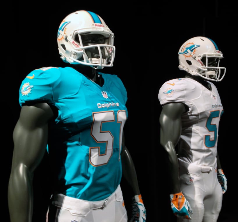
17) MIAMI DOLPHINS
I wish that aqua blue actually still looked like that. Instead it's a much lighter blue when you see it on TV. Like this:
I have always loved the Dolphins' uniforms. The colors can be too vibrant to some, but boy do they match the city. That's the thing that's so cool about them. They are their city in uniform mode. See:
I'm showing a lot of pictures because I want to get this uniform's proverbial back. The only problem I have is that they tweaked it too much this year. I'll get used to the new "jazz-hands" dolphin on the helmet, but I won't forget the older ones (much better), I'll get used to the Easter egg finishing touches on the blue, but I won't forget the old aqua that reminded me of an ocean (much better). The Dolphins would have gotten 5 stars right out the gate, but the new tweaks drop them down. I'm feeling generous.
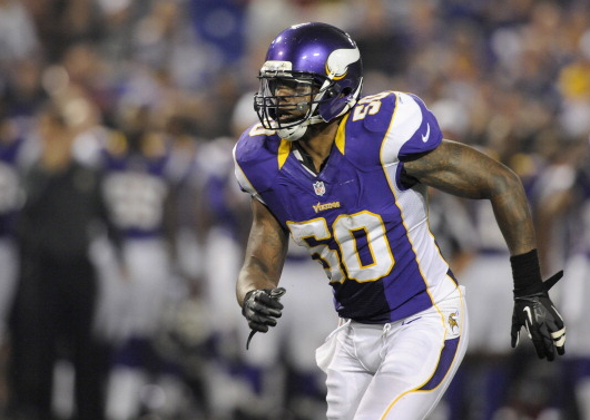
18) MINNESOTA VIKINGS
Man, oh man, I like where the Vikings have gone here. Granted, the all purple is not my style, but since the Vikings are known as The Purple People Eaters, I'll give them a pass. These uniforms have been tightened up, especially in that jersey. The stripes on the sleeves are excellent, and are a welcome change from that weird side stripe from the past couple of years:
Also, that helmet is where it's at. The Vikings do a good job here. And score well.
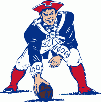
19) NEW ENGLAND PATRIOTS
Pajamas! Flying heads! And probably the worst flying head in the history of the NFL. Let's take a closer look at the alternate/throwback uniform and go from there:
Oh yeah, the 1980 uniform. These are one of my favorite uniforms of all time. They LOOK like patriots, and they have a badass patriot on the helmet snapping a ball like a center. You be the judge of who wins the fight here, Mean Center Patriot, or Flying Head?
The flying head logo, which looks like the face of a Transformer toy, gets major minus points, as does the pajama uniform. I get it, they won Super Bowls with the new uniform, and Bill Belichick is not going to change A THING with his superstitious ways. I'm just sorry that Patriots fans have to wear this thing. Go out and buy the throw-back jersey and never look back. The vintage red gets 5 stars easily, but the weirdo silver, blue and red get a big thumbs down. Terrible, just terrible. The only reason the Pats score any points is that we get to see the vintage uniform a couple times a year.
20) NEW ORLEANS SAINTS
The Saints like to mix it up with the combos, but it's unnecessary. The first two uniforms are on the money, but then they go and do the all-black, and the away uniform with black pants. It works for the Saints, they do it well, and also I don't think you can really mess up black, gold, and white. I would just be happy with only one alternate here, and the one I'd choose, against my beliefs, is the all-black. Why the away-uni-black-pant alternate? You should look your best on the road, make an impression, wear the gold pants. The helmet with the fleur de lis is just so cool, big bonus points there. The Saints should score 5 stars, but they don't. I'm irked, and perhaps too generous here.
21) NEW YORK GIANTS
Here's the thing about the Giants, the uniform on the right is no longer the alternate. I could not find this year's altern
ate, which is only substituting white pants for the grey, so just keep focus on the two leftmost uniforms as you read. Congrats, you don't have to listen to me complain about Big Blue wearing red at home (though, I still like the red jersey).
So, what's the rating? Awesome. The Giants have one of my top 5 favorites in the league. There isn't anything flashy, they look old-school, and the NY on the helmet is classic. The fact the Giants have gone back to their roots gives them big points, but the biggest factor here is that road uni. Best road uniform in the league, as far as I'm concerned. This one's easy, 5 stars.
22) NEW YORK JETS
I really want to love the Jets' uniforms, but I only like them. I just can't stand those sleeves. I love the helmet and the colors, and the alternate/throwback is awesome, but the Jets just fall a bit short. Not by much. It's the sleeves. I mean, look at Joe:
Oh, you have the sleeves too, Broadway? I didn't realize. I dug further, as you'll see in the next photo, and found that the Jets have had a bit of a sleeve identity problem over the years:
Maybe they'll nail it soon, either way they get a solid score for looking like classics.
23) OAKLAND RAIDERS
The Oakland Raiders. They have hardly touched a thing since 1963 when they were messing around with yellow. I think they had a couple tweaks through the years with changing numbers from black, to silver, to black, but these are plain ol' classics. These uniforms have that lovely menacing quality you look for in an NFL uniform, and the helmet logo is awesome.
These uniforms need no more discussion. 5 stars please.
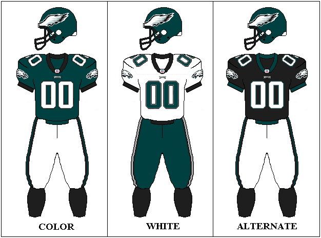
24) PHILADELPHIA EAGLES
UGH! Why?! Why are you messing with the black trim, Eagles? And your alternate stinks! I am so mad at these uniforms because they were once a 5 star package:
These were perfect. And now all you have is a tampered-with uniform that instills fear in the hearts of no one. I hate the Eagles uniform changes over the past 15 years. Pick a new green too. What the hell happened? In the words of Philly fans, "Boo. Hiss."
25) PITTSBURGH STEELERS
Whew! This is exactly what we needed after that one star performance. The Pittsburgh Steelers have, once again, a top 5 uniform for me. And, like the Packers, we aren't going to rip on those inmate, bumble bee throwbacks that apparently came from a time we can never understand. The Steelers not only have a badass color combination, they sport an excellent helmet logo which represents the original Steel logo:
The logo sits on one side of Pittsburgh's helmet and reads Steelers instead of Steel. There's history in these uniforms, and that lends a lot to my rating. The Steelers nail 5 stars without a hitch.
26) ST. LOUIS RAMS
Zzz... Zzz... Oh, sorry, I fell asleep looking at these uniforms. Remember when the Rams used to wear the blue and yellow uniforms on a daily basis? Those were the days. Better yet, remember these?
Yeah, those are the Rams. As for now, I love the blue and yellow alternate/throwback, can handle the road whites, but when I look at those home blues... Zzzzzzzzz...
27) SAN DIEGO CHARGERS
Let's start with the helmet and work down. The bolt is tops with me, and they look so much cooler with the white helmet. I don't really have too much trouble with these, except that I've always loved the powder blue much more than the dark blue, but the Chargers have turned a corner. I love the bolt touches in the jersey and pant stripes. I was going to trash this uniform at first, but now I'm loving it more and more.
28) SAN FRANCISCO 49ERS
This one rounds out my top 5. These are classic, and SF finally got rid of the black trim and face mask color-changing they were toying with for a while. They must of looked at the Eagles and Lions and said, "do we look like that?" A welcome change back to their roots. The 49ers' grey face mask reminds me of Pop Warner football when I was a kid. Everyone had grey face masks. It works here. The whole thing works.
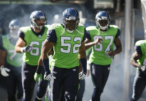
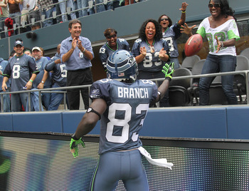
29) SEATTLE SEAHAWKS
These are pretty much the uniforms, I think. You see, Seattle is Nike's bitch and so you never know what you're going to see on Sunday. Maybe this:
Maybe these:
Or, if you're lucky, you'll catch a game with one of these:
Why they stopped being the Hartford Whalers of the NFL is beyond me. I loved these uniforms, and they matched their baseball brothers, the Mariners. Then they changed. And I understood when they went with that sea-grey they were doing for a while. They looked like a rainy day on the ocean, much like the city of Seattle:
But the neon-green touches have always baffled me, they still do, and they're getting worse. Now I don't even know what they're doing. I don't even want to write about it anymore. I hate this year's new look. Maybe next year will be different, but knowing Nike gives me a bad feeling. Good luck, 'hawks.
30) TAMPA BAY BUCCANEERS
This is pretty much it. The Bucs did a 180 when they changed their uniforms, and I did not like it. I mean, no one celebrates a touchdown better than a 300 pound lineman who looks like a creamsicle:
And that's probably why I liked them. That and the fact that they remind me of Florida, which is what the Dolphins are doing, and where the Jaguars fall short. The new rusty-blood orange is okay, but only okay. And the new logo isn't a flying head, which is nice:
But I liked the old Buc better:
I don't know what else to say.
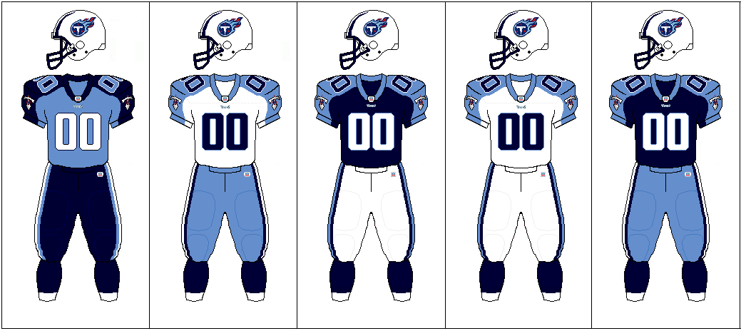
31) TENNESSEE TITANS
The Tennessee Titans. Kings of the shoulder-sleeve thing. They came into the league after being the Oilers, pretty much kept the old Houston colors, and then destroyed it. I heard that this is a favorite uniform of NFL players. I don't remember where I heard it, and I'm trying to forget that I did. Someone who is 20 years younger than me may have this in their top 5, but I don't. The only thing I'll give the Titans is the helmet logo. They stayed away from the flying head. That must have been tough to do.
Before I rate this piece of crap, let's take a look at what they used to be:
I miss you, Oilers.
32) WASHINGTON REDSKINS
I know, Washington has to deal with that name, but we aren't here rating team names, we are rating uniforms, and this one is a perfect ending to this blog. Home, away, and alternate are all perfect. Washington's uniforms are so good I may just have to change my top 5 to a top 6. No more discussion here.
Before we go I would like to show one more uniform set. This year, the NFL (cough, NIKE!), has unveiled their new AFC/NFC Pro Bowl uniforms. They are so Nike-college guinea pig-like that it is a window into what the future holds. And the word that comes to mind is robots. Better yet, robots and jetpacks. That's the future of the NFL as far as these uniforms are concerned:
Here's the thing, I love that Nike chose grey vs white. That much is cool. It would have given the myriad of NFL helmets in the Pro Bowl a better chance of matching the jersey. My god, why must they constantly add neon to every thing?! What I see here, regardless of the helmets, is the Tampa Bay Buccaneers vs the Seattle Seahawks in the year 2025 (minus the jetpacks). 0 stars.