From the days of staring at the football helmets on my fourth grade, NFL lunchbox, to conceiving new uniforms in Madden Football's creation mode, I've always been fascinated with on-the-field sports attire. I may even watch a game based solely on the fact that the uniform match-up is better (sorry Jacksonville vs Carolina, I'll never watch your uniforms go head-to-head... urp... I just puked in my mouth a little at the thought of it).
Lately, uniforms have gone crazy and most of the blame falls on Nike. If you don't know where the sports gear giant is based, let me give you a hint:
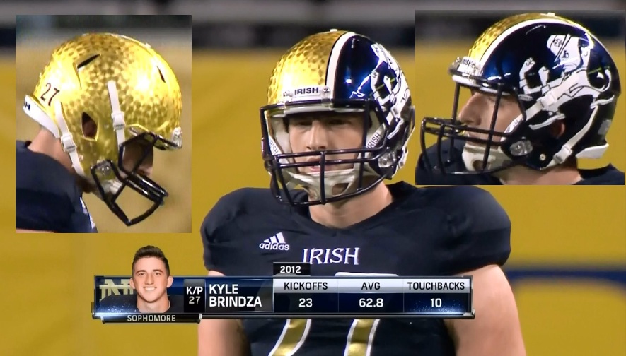
The Oregon Ducks, thanks to Nike, have been the guinea pig for uniforms. I've come to expect it now from the Ducks on college football Saturdays, but it didn't stop there because all the other sportswear companies felt the need to keep up, adding more bile in my throat. You see, when classic uniforms, such as Notre Dame's, get a make-over, I get heated.
Hi, my name is Skip, and I have a uniform problem. Hi Skip!
Yes, I'm a nerd about this, and perhaps I have a taste for things that are more on the classic side. That's not to say I am unwilling for change, it's just that I never, ever, want to see this again:
I can even deal with it,
a little bit, if it only stayed in College, but it's creeping into the NFL, and I hate it. So, before all the cool NFL uniforms are gone by way of shiny helmets and strange patterns, let's break down what we have right now. I have composed a rating scale from 0 stars to 5 stars. 0 stars = bad, 5 stars = excellent (you figured that, right?).
All ratings are done in Alphabetical order.
Let the fun begin!
1. ARIZONA CARDINALS:
The Arizona Cardinals used to be one of my favorite unis. The helmet is still cool, as the bird has only changed slightly, and the color scheme is great, even with the black alternate, but it's that new piping along the jersey that I don't understand. A good friend of mine, and lover of uniforms as well, calls it "the pajama uniform", and I couldn't agree more.
Side note:
The pajama uniform is most prevalent with UCONN
What is with that piping? Did you just open your Christmas Eve gift, little Johnny? Did you get UCONN pajamas? Good night!
So, Cardinals, your classic helmet gives you big points. As far as the uniform, I'm not really into the piping or that two-tone thing on the shoulders and under the armpits, also your alternate is looking better than your primary uniform. You wear pajamas. You get:
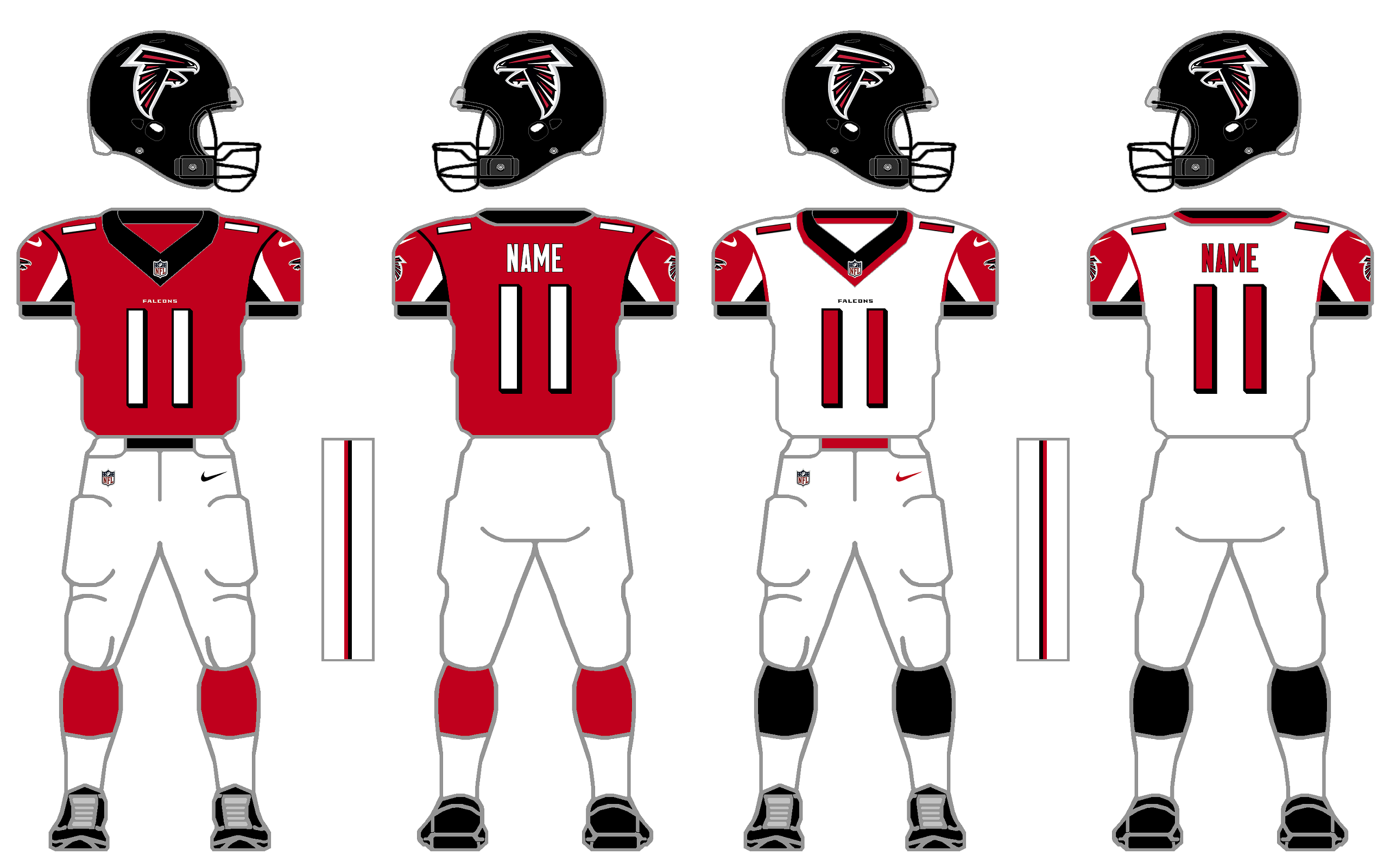
2) ATLANTA FLACONS
I was always a fan of Atlanta's old red helmets and red jerseys, then coach Jerry Glanville rode into town with his love of wearing all black. He used to wear black on the sidelines so he would be easily visible to his players, then the Falcs made their uniforms all black, so I don't get how that all worked out. But what we have here is a combination of classic Falcons mixed with Glanville's Falcons and I think it works. I like the helmet and the color scheme, but I'm still not sold on those away uniform sleeves. Overall, a good score:
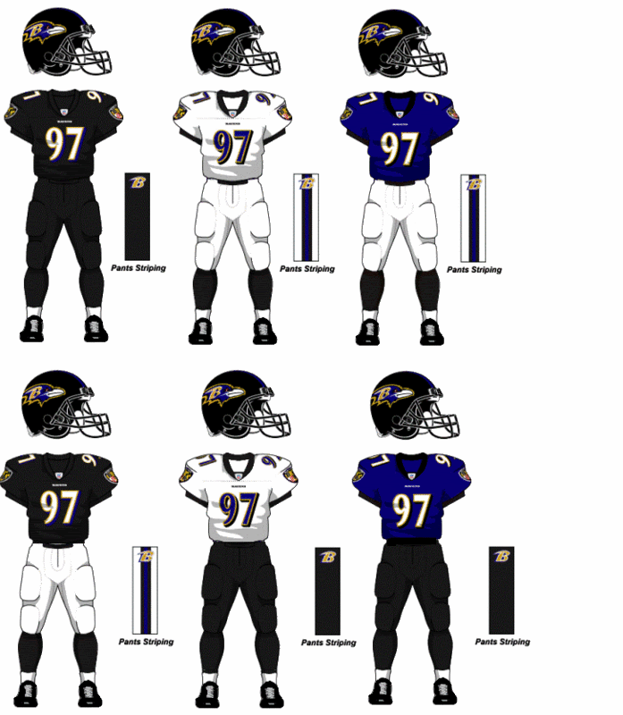
3) BALTIMORE RAVENS
This team. First of all, are you purple, are you black, and why does your purple sometimes look blue to me? Also, make a decision! I'll say this, the road whites and the home purple with white pants are just fine, especially with the black accents, but the all-black has to go. Some college teams do all one color, and it barely works there. I can't stand the one color NFL home uniform, just can't. Please stop. And let me point out this is the first of many helmets with, what I like to call, the flying head logo. It's not as bad as some of the others we'll see, but it's a trend. Besides, the raven on the helmet looks disinterested, doesn't it? As if it realized it left the iron on and that's all it can think about.
So, not great here. Six different uniform combinations? Flying head logo? Ugh. Okay, I like two of the combos, and extra points for the jersey standing on it's own with the cool crest on the sleeve, but it's not working as an ensemble.
4) BUFFALO BILLS
For a while there, the Bills had some terrible looking uniforms. They had red helmets with an all-blue jersey and pant set, then the two-tone shoulder thing... Finally they got it right. The stripes are great, the color scheme, the classic white helmet. Buffalo has turned the corner. The only thing I do not like is the streak through the buffalo on the helmet. Is it a buffalo from outer space? Is it wearing a jet pack I don't know about? Remember this?
Just an awesome logo right there. No need for that buffalo to fly, because buffaloes don't fly. Go back to it! Either way, the Bills score big here.
5) CAROLINA PANTHERS
As I look at these uniforms, I am not hating them as much as I thought, but there's just something about them that irks me. Definitely the flying head. That much we know. I think the Panthers stream-lined their uniforms since they first came into the league. It's just that black and blue combo that doesn't seem to work. I hate that home black jersey, and the alternate looks like the Detroit Lions. There isn't any over-design, which is nice, but something doesn't sit right with me. Maybe it's the way they match-up against other uniforms. Not good. Just eh. Where the Ravens tried too hard and received 2 stars, the Panthers get the same score for just being boring and putting me to... Zzz...
6) CHICAGO BEARS
What can you say here? Perfection. The league demands an alternate uniform, and the Bears got rid of that hideous orange jersey they used to use as their alternate, so I have no complaints. I do miss the C on the helmet on the right, but the plain helmet works too. Congrats, Bears, you're our first 5 star uniform.
7) CINCINNATI BENGALS
Here we go again! Do you need that many uniforms? Whatever.
I have always loved that Bengals helmet. My wife hates it and I don't understand why. In a league full of flying heads this helmet is a breath of fresh air. It looks like a tiger! I love it and always will. What I don't love are the sleeves, the pant stripe. Why not just dress up as tigers? Also, the two-tone jersey shoulder thing is crap, why is everyone doing this? Learn from the Bills and run away as fast as you can from those shoulders.
I can deal with the top right uniform, would love to make adjustments to the middle-left road version, and would keep the bottom one as the alternate. The other two must go! Cincy's helmet rocks, the uniform as a whole falls short. Believe me, those jerseys look better here than on TV, and that's not saying much.
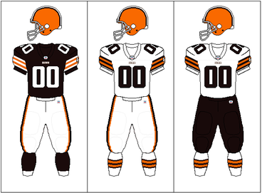
8) CLEVELAND BROWNS
Here is another classic. These are in my personal top five NFL uniforms. That plain, orange helmet, with brown and white stripes says more than any flying logo head could ever say. I could do without the brown pants because those road whites are money, but as far as alternates go, Cleveland has kept it simple. Maybe it's my love of Thanksgiving that brings forth warm fuzzies when I see this uniform, or maybe it's just the old school quality. Either way, like the Bears, this one gets all five stars.
9) DALLAS COWBOYS
Well, get ready for another 5 stars. While I'm not a fan of those two-tone shoulders, I have to say that it's done nicely here on the alternate set. These uniforms haven't changed much over the years, and for good reason. If it ain't broke, don't fix it. Nothing to fix here. The Dallas star get 5 stars.
10) DENVER BRONCOS
Huh boy, here we go. Let's start with the flying bronco head. It's terrible. It's especially terrible since they used to have an angry, snorting bronco sticking out of a D on their helmet:
Much cooler then.
I don't mind the colors, I just can't stand the numbers and design of this uniform. They won two straight Super Bowls in the late 90's with these. They lost Super Bowls with their old ones. I get it. I just don't like it. I'll give the Broncos that swoopy leg stripe, I think they were the first to wear that. Hate the all blue uniform, of course. I'm not a fan here.
11) DETROIT LIONS
Let's start with the helmet, great logo, a charging lion. Perfect. Next the color scheme, decent. You see, the Lions, like so many others, felt the need to add that black trim. Silver, white and blue is just fine, but nooooo, they have to be tough guys and add all this trim. It doesn't work. Other than the helmet logo they just annoy me. I have to give them higher than the Panthers because they did this scheme first, but otherwise they need to go back to their roots to get good marks:
So much better without that black trimming. For that I give them only 2 1/2.
12) GREEN BAY PACKERS
There is nothing wrong here. I can't trash the alternate too much, since it's a way back thing, so I won't. The green and yellow uniforms are iconic. They are classic gems. Everything works. Definitely in my Top five.
13) HOUSTON TEXANS
When the Houston Texans came into the league I thought, "oh no, another electric blue, weirdo uniform team". Not so. I love the richness of the colors. I love the logo. Yes, I love the logo. It's not a flying head. While it is the head of a steer, it has a little more oomph than your run-of-the-mill flying logo head. The steer sort of has the shape of the state, as well as that Texas star for the eye. It works.
I do not like the all-blue, but as far as one color uniforms go, the Texans pull it off. I think it's in the touches. The stripes are in all the right places. This one is my shocker pick. You'd think I'd be against it, but I'm not.
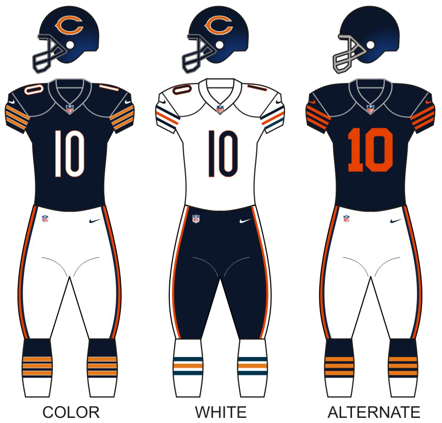
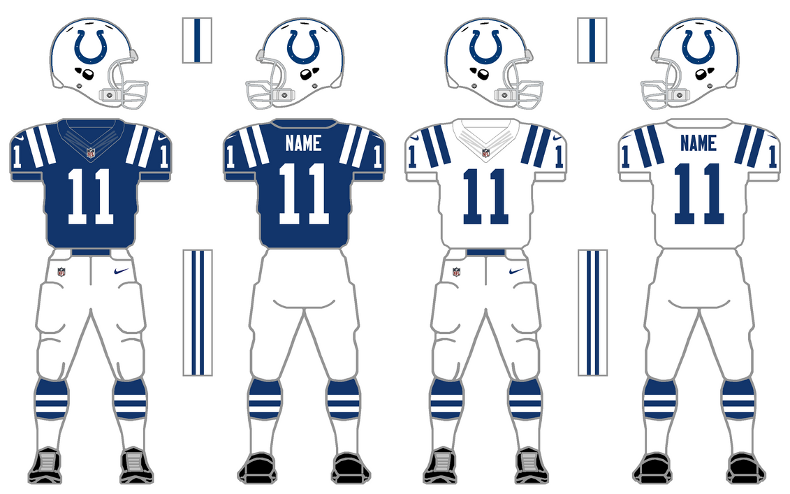
14) INDIANAPOLIS COLTS
I am not sure if there is a Colts alternate uniform this year, but let's just look at these. One of the best helmets ever created. This uniform is plain and simple and that makes it badass. There's nothing negative to say except that collar that Nike has put on every uniform. I hate that collar, but I'm keeping that out of the ratings since all teams are suffering with it. The Colts have a perfect uniform.
15) JACKSONVILLE JAGUARS
Let me take a look at each one of these. Hate it, hate it, hate that one, hate that one too, aaand I also hate the last one. Too many uniforms, all of them bad. I hate the flying jaguar head with the green tongue, I... I... I just don't understand this scheme. The Jags and Panthers joined the league at the same time and both went with bright blue and black. While the Panthers chose silver, the Jaguars went with gold to trim. Neither hit the mark. Perhaps it's trying to look like a jaguar on the ocean? I'm reaching. I hate the teal blue, I hate the all-white, I hate the all-black. If I had to pick one I would choose none of them.
16) KANSAS CITY CHIEFS
Maybe I DO want a hot dog with mustard and ketchup after looking at these unis, but that doesn't make me hate them. Maybe they ARE Ronald McDonald's favorite team. I have always loved the KC color scheme and helmet logo. The stripes are classic. There is nothing wrong here. Move along.


No comments:
Post a Comment